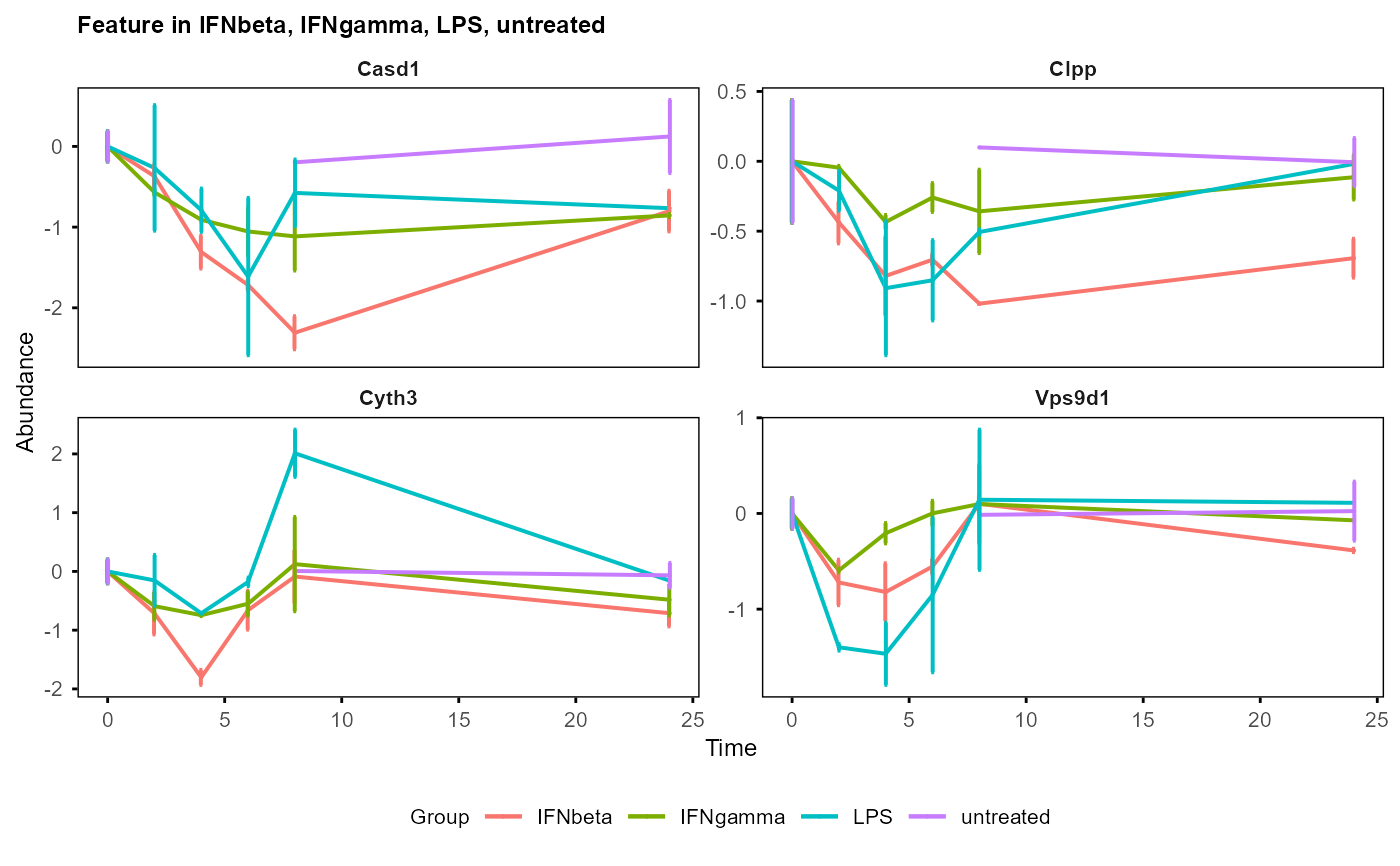
Plot trend of feature abundances / expression over time by mean and standard deviation (SD) for each group.
Usage
plot_trend(
  table_mean_sd,
  groups = NULL,
  features,
  title = "Feature",
  ylab = "Abundance",
  errorbar = TRUE,
  fontsize = 8
)
Arguments
- table_mean_sd
Output by
calc_mean_sd(), a dataframe with columns: Feature, Time, Group, Mean, SD- groups
Groups to be plotted, if NULL, all groups will be used (default is NULL)
- features
Features to be plotted, if NULL, an error will be raised
- title
Title of the plot (default is "Feature")
- ylab
Y axis label of the plot (default is "Abundance")
- errorbar
Whether to plot error bars (default is TRUE)
- fontsize
Font size for the plot (default is 8)
Examples
data("example")
table_mean_sd_list <- calc_mean_sd(example_obj)
table_mean_sd <- table_mean_sd_list$norm0
plot_trend(table_mean_sd,
    features = sample(unique(table_mean_sd$Feature), 4))
#> Group not specified. Plotting all groups: IFNbeta, IFNgamma, LPS, untreated
#> Warning: Removed 12 rows containing missing values or values outside the scale range
#> (`geom_point()`).